Web accessibility
Where Buttons Go to Lose Their Names
I built a Chromium accessibility-tree failure zoo to see how visible buttons become nameless, misleadingly renamed, duplicated, or removed.
Summarize this article
Open a prefilled request in your preferred assistant.
TL;DR
A browser does not hand assistive technology the DOM with nicer manners. It derives a separate accessibility tree whose nodes have roles, states, and flat-string names. That second tree is where a perfectly visible button can arrive unnamed, be renamed to something that contradicts its pixels, share the name More with unrelated controls, or disappear while remaining visible and focusable on the page.
I built a reproducible Chromium failure zoo with ten deliberately selected button fixtures and captured each element through the Chrome DevTools Protocol. All ten hypotheses matched Chromium 145.0.7632.6. Two exposed buttons had empty names, one visible button was ignored by the accessibility tree, five visible labels disagreed with their accessible names, and two unrelated actions both arrived as More.
The most cursed fixture looked like Open settings but was exposed as Activate self-destruct mode. The browser was not hallucinating. It was following aria-labelledby exactly as instructed.
The DOM has a second, quieter output
Front-end developers spend most of their time looking at three representations of an interface: the source code, the DOM, and the pixels. Accessibility adds another one that is easy to forget because it does not appear in a screenshot.
The Accessible Name and Description Computation specification describes the pipeline directly: the user agent reads the DOM and creates a parallel accessibility tree made of accessible objects. Each object exposes information such as a role, states, properties, and an accessible name through platform accessibility APIs. Screen readers, speech-control software, switch systems, and other assistive technology use those APIs rather than reverse-engineering button shapes from the screenshot.
The name is not a rich fragment of HTML. The computation ends in a flat, unstructured string. Save, Reload from disk, and the empty string are all valid outputs from the algorithm. A whole decorated component can therefore collapse into something useful, something vague, or absolutely nothing.
That collapse is not inherently bad. It is the point. A screen reader should receive Delete invoice, button, not a live reading of every <span>, icon path, animation wrapper, and CSS utility class involved in producing the red rectangle. The accessibility tree is a compression layer for meaning.
The problem begins when the compressed meaning and the visible interface stop describing the same action. At that point, the DOM is still valid, the screenshot still looks correct, the click handler still fires, and the user receives a different product.
Ten buttons enter Chromium
The experiment fixture renders ten controls covering common naming paths and failure modes. The capture script launches headless Chromium with Playwright, finds each DOM node, and asks the browser for that node's computed accessibility object using the Chrome DevTools Protocol's Accessibility.getPartialAXTree method.
For every case, the output records:
- the visible
innerTextand relevant ARIA attributes; - the computed role and accessible name;
- whether Chromium ignored the node;
- Chromium's reason for ignoring it;
- every name source and whether a higher-precedence source superseded it.
This matters because querying attributes alone is not the same as running the naming algorithm. A linter can see that aria-label exists. It cannot prove which string the browser ultimately exposes after author labels, native semantics, referenced nodes, hidden content, and fallback attributes have competed for custody.
The recorded environment was Node.js 24.12.0 on Windows x64, Playwright 1.58.2, and Chromium 145.0.7632.6. The machine-readable output includes the browser version and raw name-source summaries.
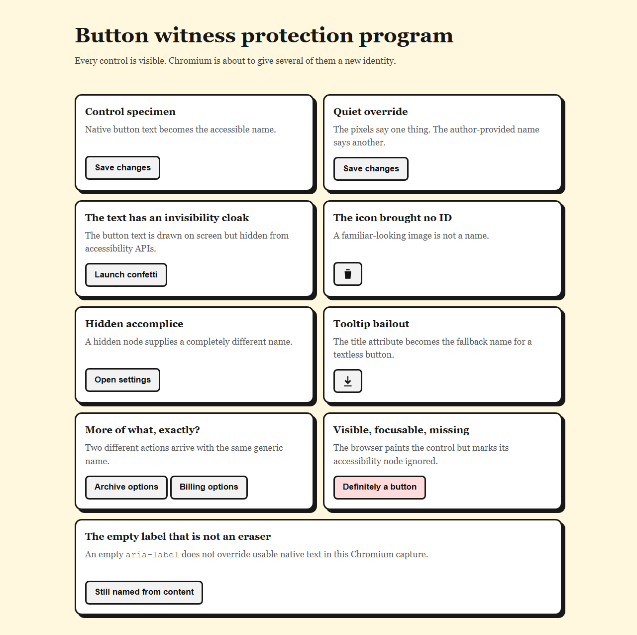
| Fixture | Visible text | Chromium name | Tree state |
|---|---|---|---|
| Native content | Save changes | Save changes | Exposed |
aria-label override | Save changes | Delete account | Exposed |
aria-hidden child | Launch confetti | Empty | Exposed |
| Icon only | No text | Empty | Exposed |
| Hidden reference | Open settings | Activate self-destruct mode | Exposed |
title fallback | No text | Download invoices | Exposed |
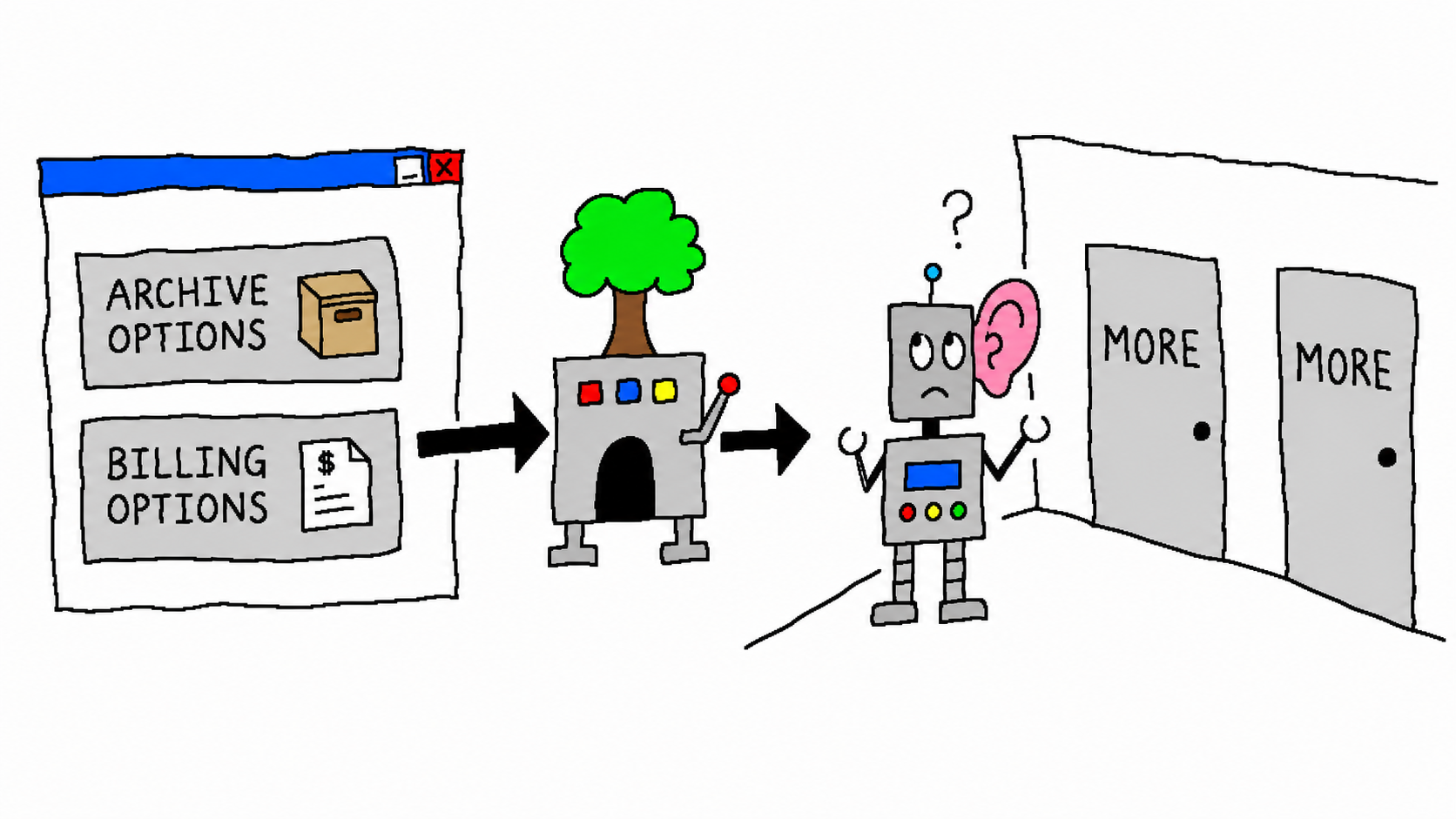
| Generic label one | Archive options | More | Exposed |
| Generic label two | Billing options | More | Exposed |
aria-hidden button | Definitely a button | Empty | Ignored |
Empty aria-label | Still named from content | Still named from content | Exposed |
All ten outputs matched the declared hypotheses. That is useful confirmation of specific mechanisms, but it is not a claim that 20% of buttons on the web are nameless. I selected the failures on purpose. If a zoo has two giraffes, we should not conclude that 20% of Earth is giraffe.
How visible words become an empty string
The first nameless button is almost offensively simple:
<button>
  <span aria-hidden="true">Launch confetti</span>
</button>
Chromium paints Launch confetti. innerText returns Launch confetti. A screenshot contains Launch confetti. The button's computed accessibility role is still button, and the node remains focusable and exposed.
Its accessible name is the empty string.
Button roles can normally take their names from content, but aria-hidden="true" marks the only child as hidden from the accessibility tree. The naming algorithm walks the remaining accessible content, finds nothing, checks the unused fallbacks, and returns empty-handed. The button kept its body and lost its passport.
The icon-only specimen reaches the same output by a more familiar route:
<button>
  <svg aria-hidden="true" viewBox="0 0 24 24">...</svg>
</button>
Hiding a decorative SVG is usually correct because a path description is not a useful control label. The mistake is stopping there. Without visible text, aria-label, aria-labelledby, or another supported naming mechanism, Chromium exposes a focusable button with no name.
This is why "it has an icon" and "it has a label" are different statements. A trash can may be obvious to one sighted user in one context. It is not a stable text alternative, and it cannot be spoken, searched by voice, or displayed in a rotor as an intention.
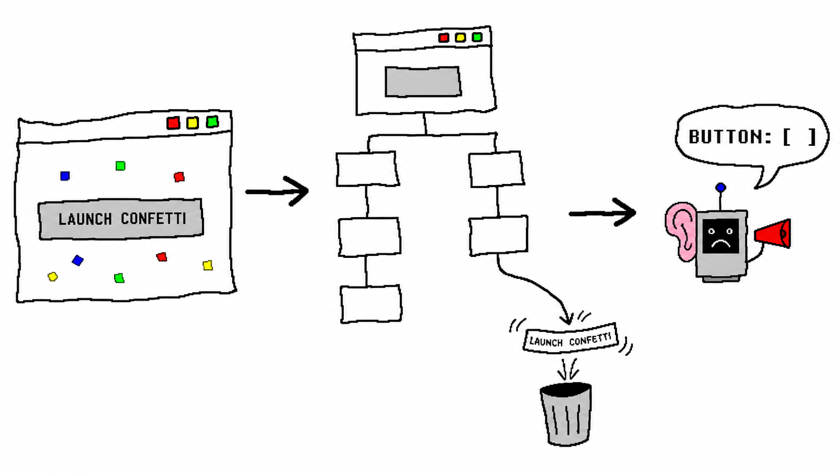
Launch confetti while the accessibility tree receives a button with an empty name. Subtext: The confetti survived; the noun did not. Source: generated with GPT Image 2.ARIA can overwrite a truthful button
The next failure contains too many names rather than too few:
<button aria-label="Delete account">Save changes</button>Chromium exposes the role button and the name Delete account. The visible text Save changes appears in the name-source trace, but it is marked superseded.
This follows the precedence rules in the accessible-name computation. For a button, an author-provided aria-label wins before name-from-content. ARIA did not add a helpful backup label to the native button. It replaced the button's existing name.
That difference matters for more than screen-reader speech. WCAG 2.2's Label in Name criterion exists because users of speech input may say the words they can see. If the screen says Save changes while the programmatic name is Delete account, a voice command based on the visible label may not find the control. Someone can be looking directly at a button and still be told they named the wrong button.
The safe pattern is boring in the best way:
<button>Save changes</button>Use native text when the control already has visible text. Use aria-label when a control genuinely has no visible label, such as a textless icon button, and make the programmatic name describe the same action a sighted user sees. ARIA should not be a second copy deck hiding behind the first one.
One useful nuance appeared in the control fixture:
<button aria-label="">Still named from content</button>Chromium exposed Still named from content. Under the current algorithm, an empty or whitespace-only aria-label is not a usable author label, so name-from-content still gets its turn. An empty attribute is therefore not a portable way to erase a native button's name. If the goal was to silence the control, the markup failed; if the empty string arrived through a templating bug, the native text prevented a worse result.
Hidden text can still name a visible control
The naming rules become counterintuitive around references. Hidden content is generally excluded, but content directly referenced by aria-labelledby or aria-describedby can still participate. The current AccName 1.2 draft is explicit about this exception: an author can intentionally pull hidden text into the name or description through those relationships.
The fixture uses that rule like a tiny supervillain:
<span id="danger-label" hidden>
  Activate self-destruct mode
</span>

<button aria-labelledby="danger-label">
  Open settings
</button>
Chromium exposes Activate self-destruct mode. Its trace identifies aria-labelledby as the winning related element and marks the visible Open settings content as superseded.
This result looks absurd because the strings are absurd, but the mechanism appears in ordinary component code. A dialog header is visually hidden on one breakpoint. An ID is reused after a list reorders. A button points to stale helper text. A server-rendered identifier and a client identifier disagree. The browser does not compare meaning and intervene when Billing accidentally references Shipping. It resolves the ID and computes the requested string.
Hidden referenced labels are useful. They let a concise control receive context that would otherwise clutter the layout. They also create a dependency that screenshots cannot show. When a referenced label changes, the control can be renamed without one pixel moving.
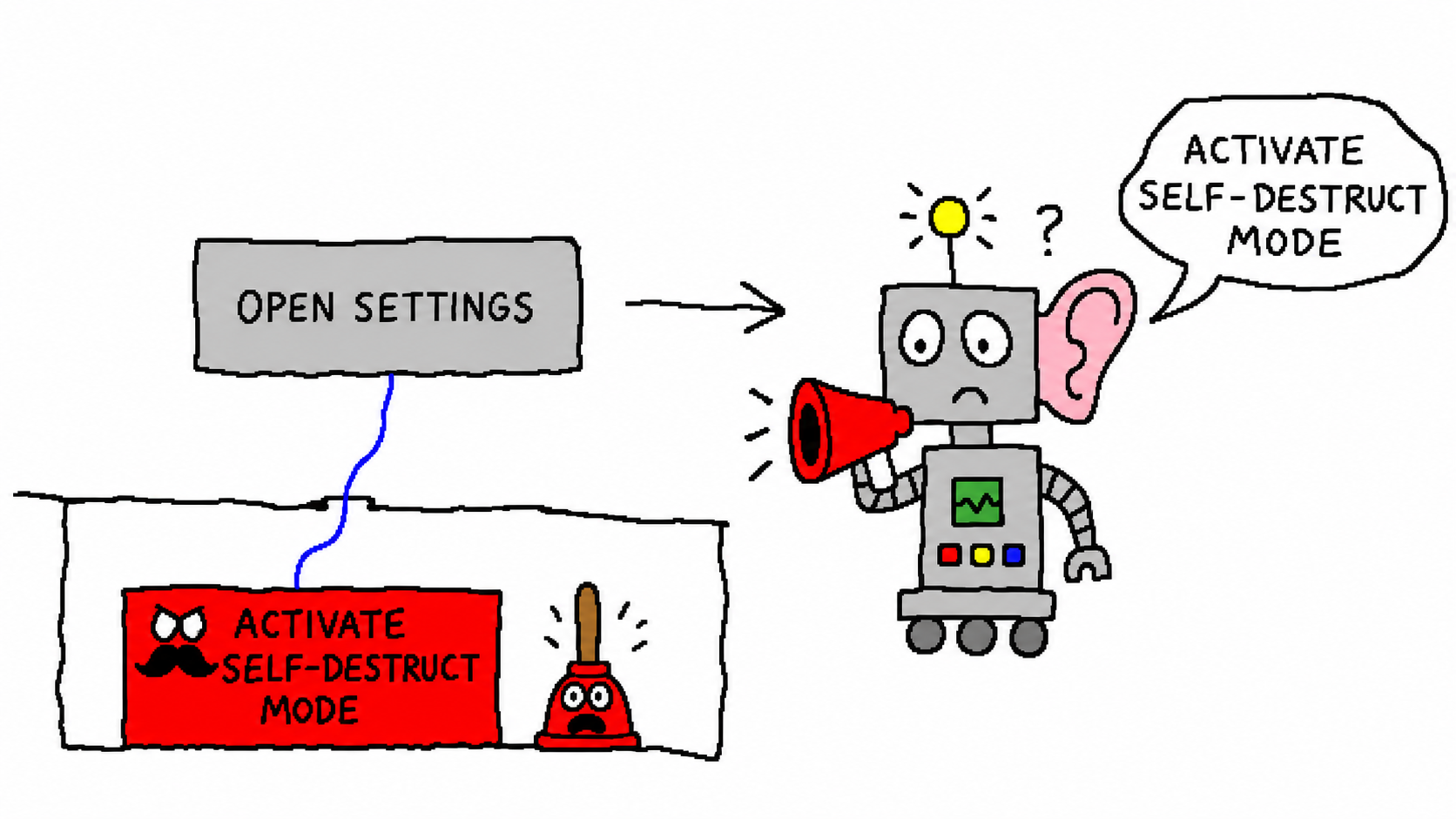
aria-labelledby follows the hidden reference and supersedes the visible button text. Subtext: The settings menu has acquired launch authority. Source: generated with GPT Image 2.A visible focusable button can disappear
The most direct removal is also the one the authoring guidance tells us not to do:
<button aria-hidden="true">Definitely a button</button>The button remained painted and keyboard-focusable in the page. Chromium returned an ignored accessibility node with the reason ariaHiddenElement. It had no exposed button role and no name.
The W3C's Using ARIA guidance warns against applying aria-hidden="true" to focusable elements. The resulting experience can move keyboard focus to a control that assistive technology does not announce as an operable object. Focus has arrived somewhere the accessibility tree insists is not part of the trip.
This is different from hidden, display: none, or visibility: hidden, which also remove the element from normal rendering and keyboard navigation. aria-hidden only changes accessibility exposure. It is a scalpel, and attaching it to an interactive control is surgery performed from the hallway.
The fix is not to add another label. Remove aria-hidden from the focusable control. If an entire inactive region should be unavailable, disable or remove its interactive descendants through the same state model that hides the region visually, then test focus order and accessibility exposure together.
More is technically a name
The two duplicate fixtures did not lose their names. They lost their context:
<button aria-label="More">Archive options</button>
<button aria-label="More">Billing options</button>
Both arrive as More, button. Chromium is faithfully applying the author labels. The accessibility tree now contains two controls with the same role and name even though their visible actions differ.
Duplicate names are not automatically invalid. Two Remove buttons can make sense when each is nested inside a group whose name is announced. A row-level button can inherit context through aria-labelledby, such as Remove Ada Lovelace. What matters is whether the accessible object carries enough information at the point where a user encounters or searches for it.
Generic labels become especially painful in lists, tables, and menus because assistive technology can present controls out of their full visual context. A page with nine More buttons has technically named everything and communicated the verbal equivalent of nine identical unmarked doors.
Test the interface the browser actually exposes
Each broken specimen can pass a surprising amount of ordinary front-end validation:
- the HTML parser accepts it;
- TypeScript has no opinion;
- the click handler works;
- the button is visible in a screenshot;
textContentreturns the expected words;- a CSS selector finds exactly one element.
Those checks answer useful questions, but none asks what role and name the browser exposes. Accessibility failures survive when the test suite only inspects implementation detail.
Role-based locators are a cheap first line of defense. Playwright recommends user-facing locators such as role and accessible name, which means the test exercises the same semantic surface the component is supposed to produce:
const save = page.getByRole("button", { name: "Save changes" });

if ((await save.count()) !== 1) {
  throw new Error("Save changes is not exposed as one named button");
}
That assertion fails for the Delete account override, the nameless child, and the ignored button even though all three remain easy to select by ID. For repeated controls, assert the contextual name instead of congratulating the page for containing twelve buttons called More.
The raw accessibility tree remains useful when a high-level locator fails and the reason is unclear. The experiment records name sources precisely for that purpose. In the hidden-reference case, the trace shows:
aria-labelledby -> "Activate self-destruct mode"   [used]
contents        -> "Open settings"                  [superseded]
That is much faster to debug than staring at a correct-looking screenshot and negotiating with the button.
A practical component checklist is short:
- Prefer native interactive elements and visible text.
- Give every exposed interactive control a concise, action-specific accessible name.
- Keep the visible label inside the accessible name when both exist.
- Do not place
aria-hidden="true"on focusable content. - Assert role plus name in automated tests.
- Inspect the browser accessibility tree for reference and precedence bugs.
- Manually test representative flows with keyboard and actual assistive technology before shipping.
Automated tree inspection does not replace screen-reader testing. It catches a lower layer of failure early, where the bug is still a string and not a customer support transcript.
Reproduce it instead of trusting the haunted buttons
The artifact is deliberately small. From the published experiment directory:
npm install
npx playwright install chromium
npm run capture
The script renders fixture.html, captures every target node, writes the JSON report, saves the full-page evidence screenshot, and exits nonzero if any computed name or ignored state differs from the declared hypothesis.
You can add a case by creating another button in the fixture and adding its expected output to cases in capture.mjs. This makes browser upgrades useful rather than mysterious: if the implementation changes, the failed hypothesis points to the exact node, expected name, actual name, and name-source chain.
What this experiment does not prove
The capture stops at Chromium's accessibility tree. It does not record NVDA, JAWS, VoiceOver, Narrator, TalkBack, speech-recognition software, or switch-control output. Assistive technology can combine roles, names, descriptions, position, and surrounding context differently, so this article does not claim an exact spoken phrase.
It also does not test Firefox or WebKit, dynamic label changes, shadow DOM, framework portals, translated strings, duplicate IDs after hydration, or names assembled across embedded controls. The specifications aim for interoperable results, but browser and platform accessibility mappings still deserve direct testing when the behavior is important.
Finally, the counts describe ten hand-authored fixtures chosen to demonstrate mechanisms. They are not a random sample of websites, components, or accessibility defects. The honest conclusion is narrower and more useful: each failure mode was reproducible in the recorded Chromium build, and the raw browser output explains why.
Sources and artifacts
- Complete reproducible accessibility-tree experiment
- Machine-readable Chromium accessibility results
- Accessible Name and Description Computation 1.2
- W3C Using ARIA guidance
- WCAG 2.2 Label in Name
- Chrome DevTools Protocol Accessibility domain
Conclusion
Buttons do not have names because text happens to be nearby. They have names because the browser runs a precedence-sensitive algorithm over native semantics, author labels, referenced nodes, hidden state, and content, then exposes one flat string in a separate tree.
That algorithm is powerful enough to turn an icon into Download invoices, preserve native text after an empty aria-label, and let hidden context describe a visible control. It is also obedient enough to rename Open settings to Activate self-destruct mode, reduce Launch confetti to silence, and remove a visible focusable button from the accessibility tree entirely.
The fix is not to memorize every haunted edge case. Test the result at the semantic boundary. Ask the browser for the button by the role and name a person should receive. When that query fails, inspect the accessibility tree before adding more ARIA.
Sometimes the button did not need a more sophisticated label. It needed its original name back.