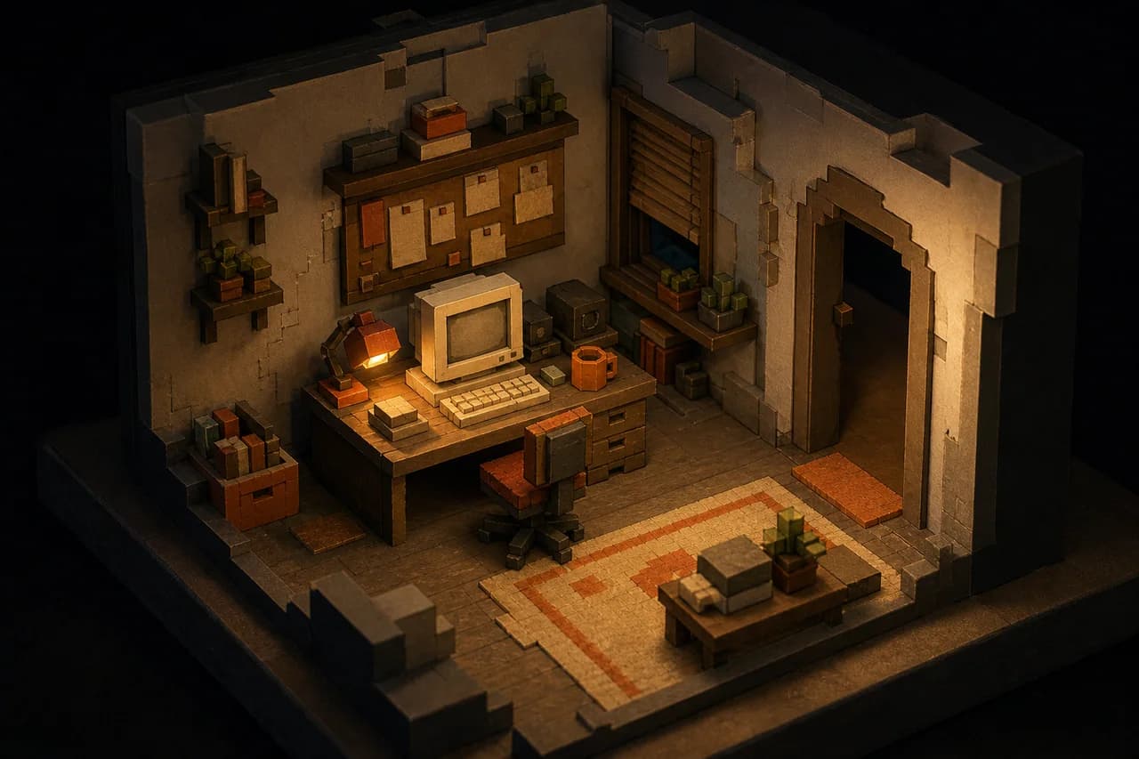
I did not want my portfolio to feel like a résumé with nicer typography. I wanted visitors to discover my work in the same way they would learn about a character in a game: by exploring a room, opening files, following clues, and gradually assembling a picture of the person who built it.
The result is a playable mystery built with Next.js, React, TypeScript, React Three Fiber, and a collection of small browser-side systems. The interface includes a navigable 3D desk, a simulated computer desktop, terminal commands, evidence cards, puzzles, sound design, and a case-file progression system. Underneath the presentation, it still has to behave like a fast, understandable website.
Designing interaction around information
The central design constraint was that every interaction needed to reveal something meaningful. Inspecting the résumé unlocks identity evidence. Solving a log-forensics task reveals education details. Project clues, a cipher, a torn document, and a bulletin board progressively expose work, skills, and contact information. A reducer owns the game state, so each discovery is explicit and testable instead of being scattered across animation callbacks.
This made the portfolio content and the game mechanics share the same source of truth. Education, experience, projects, skills, certifications, and contact details live in structured profile data. Both the conventional profile page and the interactive components read from that data, which reduces the chance that a polished visual layer drifts away from the facts it represents.
Separating the cinematic and crawlable surfaces
The homepage is intentionally client-heavy. Three-dimensional rendering, face tracking, audio, puzzles, and a simulated operating system are poor candidates for a document-first server component. I load expensive interactive pieces dynamically and keep their state in client-side providers.
Search engines and assistive technology still need a direct path to the underlying information. For that reason, the site also has a statically rendered entity profile with ordinary headings, links, experience summaries, projects, credentials, and machine-readable Person and ProfilePage data. The two surfaces serve different needs without presenting contradictory information.
This separation turned out to be one of the most important architectural decisions. An experimental homepage can keep evolving without making basic facts difficult to retrieve. It also gives recruiters and readers a fast route when they do not want to complete a detective story just to find an email address.
Keeping the 3D layer responsive
The scene uses React Three Fiber for the desk and world objects, while a consolidated projection pass maps interactive 3D positions into screen-space overlays. Components that depend on the browser are loaded only on the client. Input is normalized so the same parallax system can respond to a mouse on desktop, device orientation on mobile, or an opt-in camera tracker.
I also learned to treat animation as state communication. Camera moves establish where the player should look. Sound confirms actions that may not have an obvious visual response. Loading and transition states prevent the interface from appearing broken while large models and browser-only modules initialize.
What I would carry into another project
The biggest lesson is that unusual presentation needs conventional foundations. A creative interface is easier to maintain when content is centralized, progression is modeled explicitly, and every important fact also has a stable URL. The game can be surprising because the architecture beneath it is deliberately unsurprising.
I am continuing to develop both sides of the site: the playable experience as a design and engineering project, and the public profile and writing as a clear record of what I build and learn.